We can all appreciate it when a design has a great colour palette. However, actually creating a colour palette can prove to be difficult. This is why I have included a couple palette inspiration sources in this article, as well as a way to name your colour palettes more effectively.
Sometimes, the best place to find inspiring colour palettes can be from other people. Take these ones for example:
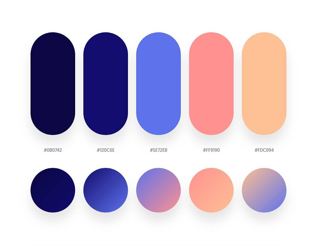
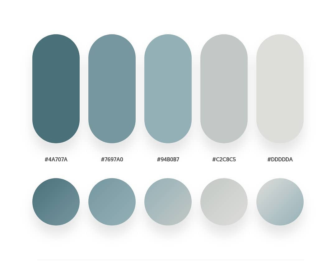
The ones on this website have been sorted in terms of their aesthetic appeal, usability, and current design trends.
However, you’re not always going to find the perfect pre-made colour palette. This is where websites like https://coolors.co/313715-d16014-939f5c-bbce8a-e2f9b8 come in.

This website allows you to randomly generate a colour palette and then, once you find something you like, you can build off of it. It’s a fantastic tool for when you’re lacking inspiration.
Finally, once you have developed a colour palette, try naming them semantically. This is a way of naming colours based on how they are used as opposed to their hue.
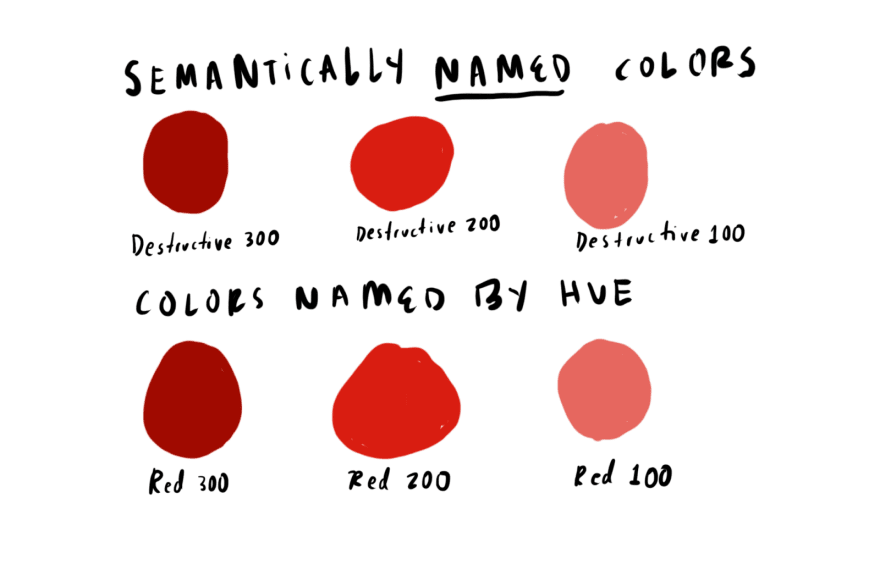
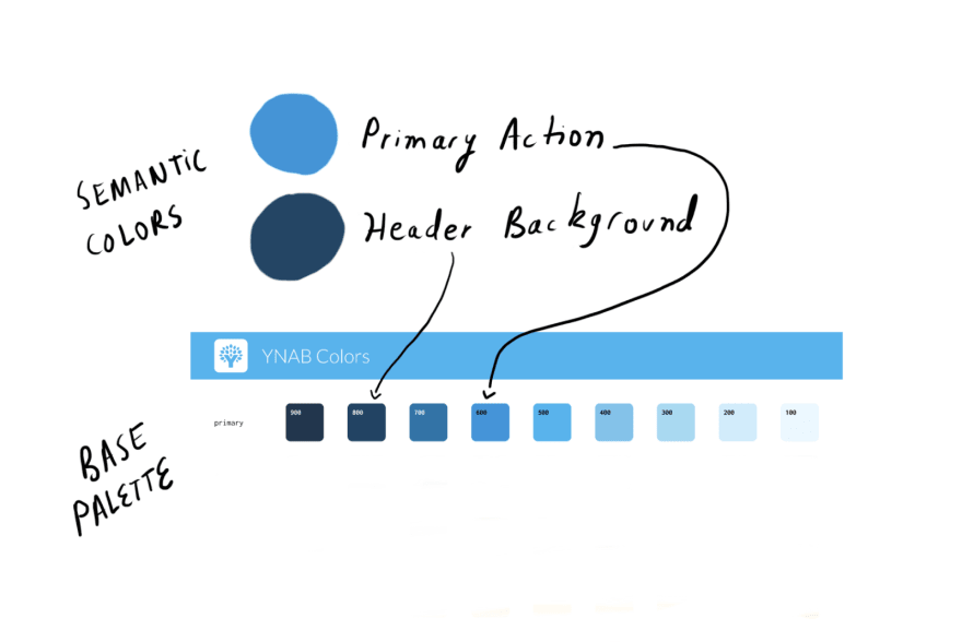
Colours with semantic names can make it easier for you to choose a colour in your design. Not only this, but semantic colours can connote what the colour means in your interface as opposed to a name like “red”.
Colour palettes can be hard to create, but with the proper inspiration and naming systems, you can make a colour palette that works for you and your design.
