Understanding what Graph/ Chart will Work Best for your Data, & why Choosing the Wrong Type can be Bad.

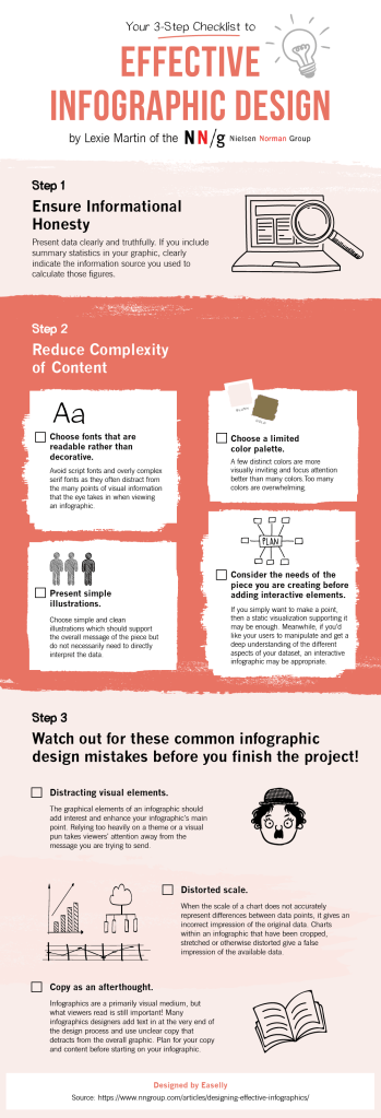
As the title implies, information designers quite often have to, well, design information. But when you’re beginning, it can difficult to choose which way you’re going to go about doing it. Knowing which charts and diagrams work with what information can help to fix this problem.

When choosing, your chart, you first have to think “what point am I trying to make”. It is integral that you know this BEFORE you design your chart/ diagram.

https://www.highcharts.com/blog/tutorials/which-charts-are-best-at-showing-data-relationships/

This article on ‘Which charts are best at showing data relationships’ by Mustapha Mekhatria is a great place to start reading about what charts work where.

There are definitely some graphs that are more frequently used than others, which isn’t necessarily a bad thing.

This article outlines the 44 best graphs/ chart used in top industries.

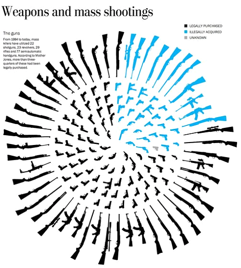
Please keep in mind that if you choose the wrong type of data visualizations, information can become incredibly misleading. (Of course, execution obviously plays a role in this too.)

https://www.statisticshowto.datasciencecentral.com/misleading-graphs/

Keep this in mind, as it is our role as information designers not to misinform.

To reiterate, choosing the right graph/ chart can totally change how information is understood, so understanding graphs and charts is incredibly important.

Some Silly Infographics for When You Need Something less Serious.

There is no denying that designing information is incredibly important and full and responsibility. A lot of the time it can feel very overwhelming to try to communicate the issues of the world truthful, non-biased way. The remedy for this? Information design is just for laughs more than anything else.

For example, look at this infographic about people named “Chad” and “Jason” becoming grandparents.

https://flowingdata.com/2020/02/23/grandpa-chad-distribution/

Is it informative? Yes. Is it heavy information? No. Did you need to know it? Well, that’s just a question you’ll have to answer for yourself.

Another great example of a not so serious chart is this one, titled: ‘My living room corner’.

https://flowingdata.com/2020/02/27/living-room-corner-pie-chart/

Admittedly, this one is not really informative, but it does serve a double purpose as both a chart and an image, and I think it should at least get props for that.

If you’re like me and just love these infographics, I highly suggest you check out the blog https://thisisindexed.com/. She so many wonderfully relatable infographics, like this:

https://thisisindexed.com/

They are simultaneously funny and smart, and she posts them (almost) every morning.

Taking in and presenting information seriously is a huge responsibility for all information designers. But just remember that it’s okay to have a good chuckle every once in a while.

How to Make a UX Portfolio; The Tools, Inspiration & Skills Required.

Like any portfolio, a UX portfolio can be a great way to showcase your design work. But it’s difficult to know where to begin, and how to go about making a portfolio. Knowing the proper tools to create a UX design portfolio, having good inspiration for your portfolio, and of course, knowing how to use it can help solve this problem.

First things first, you need to know the tools to use for making your UX portfolio. These will make it much easier for you to start building your portfolio.

https://www.interaction-design.org/literature/article/what-ux-tools-do-i-need-to-create-my-portfolio-and-how-do-i-learn-them
https://www.interaction-design.org/literature/article/what-ux-tools-do-i-need-to-create-my-portfolio-and-how-do-i-learn-

If you want to make a questionnaire, use google forms or survey monkey. If you want to make a flowchart, use Lucidchart or Microsoft Visio. (See more examples here)

Next, once you have the things to put in your portfolio, you’re tasked with actually designing your portfolio.

https://franc.tv/

Looking at what other people are doing for their UX design portfolios can help you a lot with this. Find out what other successful people are doing and take inspiration from them.

Once you have your portfolio, it’s time to put it out to the world.

https://www.interaction-design.org/literature/article/how-to-make-full-use-of-your-ux-design-portfolio

Tailor Your UX Portfolio to the Role, ask for feedback at your job interviews, and  go through your UX case studies from time to time.

Having a portfolio is just a necessity, and this is why it’s important to have a good one. So long as you have the tools, the inspiration and the knowledge you need to use it to its full potential, you’ll be golden.

Colour Palette Inspiration; Pre-made Palettes, Colour Palette Generators, and how to Name Your Colours Semantically.

We can all appreciate it when a design has a great colour palette. However, actually creating a colour palette can prove to be difficult. This is why I have included a couple palette inspiration sources in this article, as well as a way to name your colour palettes more effectively.

Sometimes, the best place to find inspiring colour palettes can be from other people. Take these ones for example:

https://digitalsynopsis.com/design/beautiful-color-gradient-palettes/#.XmAvJRrk68c.twitter

The ones on this website have been sorted in terms of their aesthetic appeal, usability, and current design trends.

However, you’re not always going to find the perfect pre-made colour palette. This is where websites like https://coolors.co/313715-d16014-939f5c-bbce8a-e2f9b8 come in.

https://coolors.co/ffffff-3b413c-9db5b2-daf0ee-94d1be

This website allows you to randomly generate a colour palette and then, once you find something you like, you can build off of it. It’s a fantastic tool for when you’re lacking inspiration.

Finally, once you have developed a colour palette, try naming them semantically. This is a way of naming colours based on how they are used as opposed to their hue.

https://dev.to/ynab/a-semantic-color-system-the-theory-hk7?ref=webdesignernews.com

Colours with semantic names can make it easier for you to choose a colour in your design. Not only this, but semantic colours can connote what the colour means in your interface as opposed to a name like “red”.

Colour palettes can be hard to create, but with the proper inspiration and naming systems, you can make a colour palette that works for you and your design.

How to Curate Your Social Media; How Much to Write, How to Curate for Different Social Media Platforms and Tips and Tricks on What to Post.

Social media has become more ingrained in most people’s lifestyles than ever before. This means, however, that design and social media have become incredibly important to each other. So it is important to know how to build a community on social media platforms.

Each social media platform comes with specific caveats, such as post length. However, there are actually ideal word counts that can make your social media content more successful.

https://buffer.com/library/optimal-length-social-media

Start with these guidelines when you begin a new post.

Next, we have to consider the more subtle points of social media.

https://visme.co/blog/social-media-content/

For example, Tweets do better when they have images attached to them,  and Instagram captions can be the key to engagement. To read more about the specific ways you can tailor your social media content, read this: https://visme.co/blog/social-media-content/

Finally, there are some general tips that can help you with social media in 2020.

https://coolinfographics.com/blog/2020/2/9/social-media-content-trends-2020

Tagging locations, analyzing analytics and ephemeral content can all help improve your social media engagement.

In conclusion, knowing how to curate your content properly is incredibly important, so take the time to learn how to do it.

Pie Charts: Confusing and overwhelming, unless you know how to follow their basic conventions, as well as the design tips that will improve them.

Pie is a delicious dessert, but sometimes it can be confusing in chart form. So how do we make pie charts work for us? In order to do this, we need to know what makes them understandable.

Some pie charts can be incredibly overwhelming and confusing, like this one.

https://viz.wtf/post/189495004858/the-most-frequent-emoji-the-unicode-consortium

There are some general pie-chart conventions that you can follow, like ordering your ‘slices’ numerically by size (with the size decreasing) and making sure that your colours signify something of value.

https://junkcharts.typepad.com/junk_charts/2020/02/pie-chart-conventions.html

But there are also many ways you can fine-tune your pie-chart so that they are GREAT, not just good. This includes sorting  meaningfully, eliminating the legend, specifying what is being shown, add a takeaway and call to action, and use colour sparingly in designs.

http://www.storytellingwithdata.com/blog/2020/2/26/how-to-make-a-better-pie-chart

Pie charts can be really confusing if they’re done badly, and incredibly informative when they’re done well.

Understand the emotional connection between users and a product, Plutchick’s wheel of design and how to tap into the reflective level of design

We remember things that have an emotional effect on us. But how can we use this to make design better? It is important to understand the importance of emotional design.

As a designer, it is very useful to know how to grasp and encourage emotional connections between users and a product.

https://www.interaction-design.org/literature/article/creating-emotional-connections

Plutchick’s wheel of design can help you think about how you might elicit emotion through design.

https://www.interaction-design.org/literature/article/putting-some-emotion-into-your-design-plutchik-s-wheel-of-emotions

We also have to learn how to tap into the reflective level of design, which is the design that completes us. To do this we have to investigate how a design might fit into and enhance the user’s life.

https://www.interaction-design.org/literature/article/the-reflective-level-of-emotional-design

Knowing how to cater to emotions can enhance our design, as they will be memorable to the user.

The difference between a font and a typeface, how to choose the right typeface, and which fonts you should NEVER use in your design.

We love seeing things that are visually appealing. But how do designers know what that their design will be visually appealing AND readable? One of the most important steps is choosing the right typeface.

The main difference between a font vs typeface is the fact that font exists as a part of a typeface. Typefaces are like families and those families contain several different family members, called fonts.

https://www.designyourway.net/blog/typography/font-vs-typeface/

Before you choose a typeface for your design, do your homework. Know what your objective is, what your demographic is, and the general type of typeface you’ll need to achieve these things. Establishing these things will help you a lot.

https://unblast.com/articles/how-do-you-choose-the-best-typeface-for-your-design/

However, there are some fonts you should never, EVER use in your designs.

https://veodesign.com/2012/en/02/26/typography-101-5-fonts-you-should-never-use/?__cf_chl_jschl_tk__=0b94d9a792f4d7c6a4d26fe417acb9236d1c3905-1582964255-0-Advy-NRxdIkKGn9QPiIrHBCZ6dEH550CYy5wRsgookqmQsDTI7dKC28WSXSJLHPrb4mp82MYpivoM9NAyW3D_6XTnauYrZNgmdnQWZ021ZFZDbfGefC_IR3YMnu5WQ_9SOGlBlRuauhNr-IeFD7wlxjuQRDsWj-uPTpymdneaaIUOCu3yEHeupy6ebqaK3IzNxR05ni2bFqrvS_wlBkzZhbw14gnzli3x0FE07R7dDrFqFmlbztXgcfC2znzCih5tBJ1SwyXAX_c8WwseFYNhi_FCXyASPs6ReVp_xWxhQ1_pVD623VeKThLh1s0_7X_NSK1wNmiPY4wFXPwVXolQgvb1VGde2DdtK2Y8C6SAUbx

Choosing the right typeface will make or break your design, so make take the time to choose the right one.

User-centred design, experience, and why we should design for the future but keep it useful in the present.

Humans are generally the target for most designs. However, as people are complex, they can be difficult to design for. This is why designers should look into the user-centred design. 

When it comes to user experience, there are 7 influential factors. A design should be Useful, Usable, Findable, Credible, Desirable, Accessible, and Valuable.

https://www.interaction-design.org/literature/article/the-7-factors-that-influence-user-experience

There are also 7 principles that go hand in hand with user-centred design. Encapsulation: Contrast, Direction cues, The Use of Lots of White Space, Urgency and Scarcity, Try Before You Buy and Social Proof.

https://www.interaction-design.org/literature/article/the-seven-simple-principles-of-conversion-centred-design-ccd-and-how-to-use-them

On top of this, you should keep the MAYA principle in mind: Design for the Future, but Balance it with Your Users’ Present. You want to create revolutionary designs that work for your users NOW.

https://www.interaction-design.org/literature/article/design-for-the-future-but-balance-it-with-your-users-present

User-centered design can help us design things that our audience will actually use.

Infographics; what they are, how to create them, and some great examples to look at before you get started.

Information is better when it can be easily understood. However, it can be difficult to present data in a way that is both informative and easy to read. Infographics help combat this problem.

An infographic is a visual representation of any kind of information or data.

https://visme.co/blog/what-is-an-infographic/#what-is-an-infographic

There are 4 steps to making useful, relevant infographic content. 

  1. Determine the usefulness
  2. Find out if it is relevant to your audience
  3. Make sure you have a good design
  4. Envision the creation outcomes for your infographic
https://www.easel.ly/blog/make-your-infographic-useful/

When done correctly, infographics can be super impactful and informative. Here are some examples of great infographics: https://www.designhill.com/design-blog/best-infographics-designs/

In conclusion, infographics are a fantastic way to help users understand data, and it’s worth the time to learn how to make good ones.

Design a site like this with WordPress.com
Get started