There is no denying that designing information is incredibly important and full and responsibility. A lot of the time it can feel very overwhelming to try to communicate the issues of the world truthful, non-biased way. The remedy for this? Information design is just for laughs more than anything else.
For example, look at this infographic about people named “Chad” and “Jason” becoming grandparents.

Is it informative? Yes. Is it heavy information? No. Did you need to know it? Well, that’s just a question you’ll have to answer for yourself.
Another great example of a not so serious chart is this one, titled: ‘My living room corner’.

Admittedly, this one is not really informative, but it does serve a double purpose as both a chart and an image, and I think it should at least get props for that.
If you’re like me and just love these infographics, I highly suggest you check out the blog https://thisisindexed.com/. She so many wonderfully relatable infographics, like this:
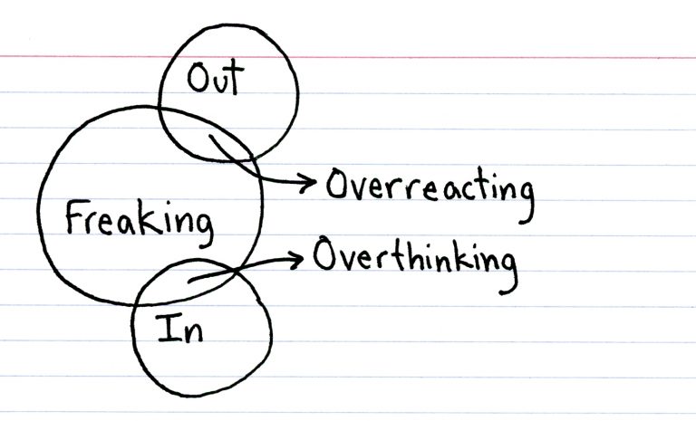
They are simultaneously funny and smart, and she posts them (almost) every morning.
Taking in and presenting information seriously is a huge responsibility for all information designers. But just remember that it’s okay to have a good chuckle every once in a while.
