Pie is a delicious dessert, but sometimes it can be confusing in chart form. So how do we make pie charts work for us? In order to do this, we need to know what makes them understandable.
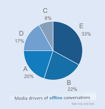
Some pie charts can be incredibly overwhelming and confusing, like this one.

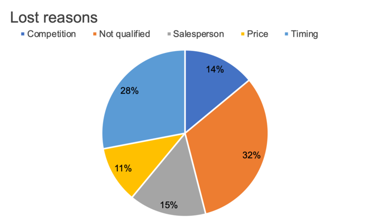
There are some general pie-chart conventions that you can follow, like ordering your ‘slices’ numerically by size (with the size decreasing) and making sure that your colours signify something of value.
But there are also many ways you can fine-tune your pie-chart so that they are GREAT, not just good. This includes sorting meaningfully, eliminating the legend, specifying what is being shown, add a takeaway and call to action, and use colour sparingly in designs.
Pie charts can be really confusing if they’re done badly, and incredibly informative when they’re done well.
